Garmin Nuvi 500 review: don't bother

A whitepaper on declining "user experience" design

I've been doing some GPS shopping, with the ultimate purpose that whatever is obtained would become a parentally-owned unit over the holidays. So far I have tended to dwell mostly in the Garmin end of the spectrum, particular looking at the "Nuvi" line of products since they seem the most popular type geared toward automotive use, and I naively took what I know and like about my own older Quest unit as a precedent that anything newer must be an improvement.

I've been sadly disappointed, despite giving it the old school try in a number of ways including actually buying the "gift" Nuvi 500 [on sale at REI!] and aiming to preconfigure it and learn enough to better coach its eventual recipient. By now I'm a reasonably seasoned GPS user and understand the common aspects behind how all of them work, so this discussion comes from an experienced viewpoint. I already had the idea that the Nuvi line was a bit more dumbed-down, but I had no idea of the extremes Garmin seems to have recently gone to in talking down to their customer base. One has to wonder if they've "downsized" all their good programmers right out the door and outsourced subsequent efforts to offshore fresh-out-of-CS-class codemonkeys who never really studied embedded programming, let alone any prior GPS interfaces.

One good method of shopping and doing product research is to read online user manuals. Garmin has always provided these freely on their website, but in looking through about any of the Nuvi manuals it is never made clear what software running on a computer is supposed to be used to interact with the Nuvi and transfer data back and forth. When I got my Quest, it included two CDs with the latest "Cityselect" NAVTEQ detail data and a copy of MapSource, their companion program for Windows, and all the stuff I'd need to set up and cross-load map data into the Quest. The Quest has somewhat limited memory, so it can't hold the entire country's map detail in one shot but I could load a respectable chunk of a given area. The assumption clearly was that the user *would* be interacting fairly heavily with a computer, so it was all included. The other great thing I rely on heavily is being able to pull my own travel tracks or "breadcrumb trail" off the unit and review routes, check elevations of interesting places, match times and places against picture EXIF data [such as for bad-trucker incident reports or "what town was that cool building in again?"], get accurate distances on MPG competition circuits, etc. Not to mention having backups of the data once the downloaded files get snapshotted to offline storage. It all feels like a nice integrated package that does what I need.

Evidently the importance of computer communication has diminished quite a bit or turned into useless fluff in Garmin's collective thinking, because the Nuvi comes with no software, no cable, and not even the full user manual in the box -- just a "quickstart" guide, in which NO mention whatsoever is made of using software of any sort. They seem to assume all users are just going to plunk it onto the dashboard and drive. But wait, when you try to access items like "geocaches" or "whereigo", the unit itself tells you that you first need to go visit some random websites with your computer. What's that all about, it's certainly not about downloading my hard-earned track from the day's roadtrip. Said third-party websites are of course going to tell you to download some software package and use it to communicate with the Nuvi, which now you can't do unless you have or get a mini-USB cable. How hard would it be to throw a cheap one into the box, guys? My Quest came with a fairly high-quality one, in fact. And it would be much more reassuring to get the software I need from the more trusted source of a physical distribution right there in with the unit, than have to go grope around the net for it.

I quickly found that my old windows-based Mapsource won't talk to this unit, which didn't surprise me a whole lot but reflects the typical short cycle of what the GPS world laughingly calls communications "standards". When the Nuvi is plugged into a USB port it immediately goes into "mass-storage" mode and renders itself otherwise completely unusable, and when the USB drive is ejected on the computer the Nuvi reboots and then goes right back *into* mass-storage mode if you don't unplug it quickly enough. What rocket scientist came up with that operational model? At least power off or do something to hold the finished state of the session the user just requested to end until the cable is actually unplugged. The Quest, although it doesn't do USB-storage mode, stays fully operational with the rest of the interface available whether it's talking to a PC or not. This is NOT one cue Garmin should have taken from some of the digital camera makers, and can only lead to problems because as people get annoyed with this and try to work around it, they're going to wind up yanking the connection to a USB filesystem that was attached READ/WRITE before it's fully synced and dismounted -- eventually screwing it up in some way and ending up with a nonbootable unit.

Ironically, the 12V car power cable also plugs into the teeny USB connector on the back of the unit, but does *not* make it go into mass-storage mode. I wonder what the exact electrical difference is?

I called the Garmin support line a couple of different times; first before making any purchase decisions just to get an idea on which units have which features, as there didn't seem to be a convenient one-page matrix of same. [Only later did I learn that *other* GPS-enthusiast sites maintain some nice feature charts of their own, but I hadn't gotten quite that far in the research process yet.] Turns out that Garmin has sort of a matrix too, but it's all Javascript-based muck and simply comes up blank in my usual no-nonsense browser setup. [Hello, anyone ever heard of standards-based HTML *tables*?? You're looking at one right now, in fact...] The next call was to basically ask "okay, now what?" in terms of software interaction once the unit was in hand, a call I'm sure they get pretty routinely because what comes with it certainly doesn't tell the buyer. It isn't made obvious from the website, either.

Calling Garmin is incredibly frustrating. Their IVR tells you right up front that you're going to wait on hold for 15 - 20 minutes, which never seems to vary. It's right. So why not, I asked them later in email, staff up the support call center appropriately especially with holidays looming on the horizon? They seem to feel that they don't owe the public anything. At one point one of my calls suddenly disconnected, either through phone system problems or representative error, with NO recourse but to wait another goddamn 20 minutes for a different person and start the discussion all over again. This is not the way to run a professional support organization, despite what seems to be a common problem around the industry. That's no excuse, and making it an excuse flags a company that has gotten way too big for its britches and lost sight of "customer care". And for the record, guys, nobody cares if your "menu options have changed", just present them as they are now without backpedaling.

It may help slightly to first give the finally-reached human a callback number and ask to be called back immediately in the event of disconnect. I suppose that could hold true for any other call center too, but many refuse to even do that much. Where lawyers and marketers will be the first ones up against the wall when it all comes down, support call-center managers will be a very close third.

While on one of the calls I asked about Mac support; the person said the equivalent of MapSource for the Mac is called "Roadtrip" but claims that it would refuse to run before you have maps loaded. Well, how does one go about that? What maps? Never made clear. I was already tired of bickering with these people, not to mention their flakey phone system and the cavalier waste of my time.

But back to the Nuvi vs. Quest comparo. The Nuvi 500 seemed the most sensible decision because it's designed to be fairly waterproof, and shows the best rated internal battery life of any of the new vehicle-oriented units by *double* -- 8 hours instead of 4 or less for all the rest, which seems strange. What's so different about the 500's power demand? A removable battery does allow for carrying fresh charged extras and swapping on a long off-road hike or whatever as needed. But even then, only 8 hours per under optimal conditions. The Quest was rated for something like 20 on an internal, non-removable battery -- what happened in the meantime to bring all the battery run-times down so drastically?

After setting the backlight less than retina-searing 100% and bringing the beep volume way down from full-blast, I could actually start poking around the interface and playing. One immediate problem is that the "restore" touchscreen-button is often too close to other options and easy to hit by mistake, offering to zorch all your work back to factory defaults. Or if the GPS receiver is off and the "set loc" button gets touched while moving around the static map, and boom, the position pip magically teleports to where you didn't want it to. Even after recalibration, the screen's touch matrix doesn't seem to be all that accurate, or the button areas insufficiently well defined to follow their image boundaries. There's no "dead" zone defined between active adjacent areas; being slightly off from one means selecting the next one over whether you like it or not. There are many arguments that a touchscreen is the wrong type of interface for anything in a car, too, since one has to look at the screen more often and cannot do things by learned feel. But most of the newer units have precisely one button -- for power, that's it. If everything else has to come through the screen, how about having an unlikely-by-accident sequence to LOCK out touches for when you're carrying it around? Any smartphone/PDA worth its salt can do that.

Confucius say:

    Man with one GPS know where he is.   Man with two GPS have no fucking idea.


[Click for larger view]

I set the new one up temporarily in the car to compare various things for a couple of days while I ran around doing my normal activities. This is me pulled off to the side briefly while tooling through Wellesley MA to change some settings, and yes, while it's unintentional positioning on my part where I chose to stop, that is a cop up ahead pulled off even farther who's likely wondering what the heck I'm doing back here running around the car and leaning into the back hatch with a camera. But what he's probably there for is waiting in the shadows for the inevitable overprivileged and overpowered numbnuts blasting up this 30-MPH stretch at 50+ in the sixty-grand crossover-ute his parents gave him, which is all good. This *is* Wellesley after all, and it gets a lot of that.

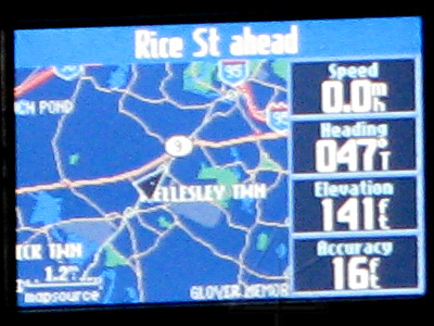
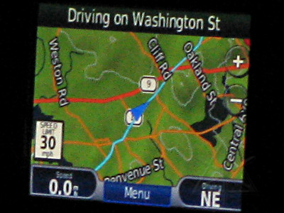
Instead of fine-grained configurability on how mapping and routing is done that the Quest offers, letting you set up all your expected average speeds on different road types and setting "lock to road" or not, the Nuvi has this foggy concept of "usage modes" -- drive, walk, or bike, which in theory cause different behaviors but I cannot discern what's really changed and the manual doesn't offer anything more than the sketchiest "it's different" explanation. I vastly prefer the 2-D map with north up rather than the hokey 3-D "flying view" that's everybody's new default including the Nuvi; that's settable. In 2-D mode the Nuvi displays terrain shading and contour lines with elevations from the *database*, as opposed to the one derived from the sats -- it comes with a full topo-enabled database, which is a big point in its favor; the downside is that topo cannot be independently turned off when you don't need to see it. Oops. What's really missing is the ability to add custom data to the running map -- on the Quest, there are four fields off to the right that can be set up to read any of about 20 different parameters, one of which I value highly is elevation. No such luck on the Nuvi, although it makes a prominent point of displaying the relief shading and many more of the contour line elevations at the higher levels of map detail. No, that's not what I wanted; I and my running track-log want how high I am right *here*, not at the next contour line. The only place elevation seems to get interactively displayed is on the "compass" page, a total of *six* touch-strokes to reach it and then get back to the running map afterward. And I'm not sure if that figure is coming off the database or a best-guess from the sats as it does from the Quest.

You have to turn on track [aka what they now call "trip log"] to see it, stretching out behind the pip in what a GPS-forum posting calls "robins-egg blue", as opposed to the nice crisp tiny white dots on the Quest. Of course there's no configuration for it such as waypoint frequency or whether to stop recording when the memory is full or roll around to the beginning again. The only options concerning track in general are see it or not see it, and to clear it. Not as useful, and a little later I found out it doesn't even capture the observed elevation data like the Quest does.

But later I realized the Nuvi's true downfall with respect to the running map. It shows even *less* useful information, never mind the lack of configurable info boxes. Compare the closeups of the Quest and the Nuvi from the same Wellesley picture, on my return trip from a meeting [which is why the blue track also shows ahead of me]. Ignore picture quality here, this is about content:

Quest Nuvi
The Quest is displaying three important items that the Nuvi appears to be incapable of showing me:
  • the *town* I'm approaching or passing through
  • the upcoming cross-street in the top text bar [regardless of map zoom!]
  • the mile scale, because the Nuvi has *covered* it with the speed limit sign
On this particular run the Nuvi resolutely said "Driving on Washington Street" across the top and nothing else ... for about five miles. The Quest, meanwhile, was helpfully telling me about everything approaching and showing the towns going by. In addition, while the Nuvi does note upcoming *highway* exits in the top text bar it does not say how far away they are, as the Quest does. A workaround for the masked mile-scale is to put it in walking or biking mode, which gets rid of the speed-limit thing. Yeah baybeee, power-walking on I-90 east at 70 MPH! But then, in Garmin's efforts to be smarter than the user, speed above some arbitrary threshold often pops up a big box that insists on a yes or no answer to whether it should go back to vehicle mode. More forced physical interaction with the thing, when all I wanted to see at a quick glance that I'm going the right direction on the highway.

And if we're going to bother having street speed limits in the database and try to display them, how about having a configurable "over" threshold above which a configurable audio warning is issued, to help the self-acknowledged leadfoot drivers rein themselves in a little? Make it enabled at 7-over by default!

The Nuvi running map, especially at higher levels of detail, seems incredibly noised up with denser contour lines and their numeric elevations, names of random nonessential side streets half a mile from where I am, and names of far more bodies of water than I need to know. All in text that's way too large, and don't think for one minute that there would be any *hint* of being able to set font sizes. [There *is* on the Quest, and for multiple item types!] And everything has a bit more trouble standing out from the terrain-shading in back, where the Quest's simple dark background [night mode] gives a much crisper display. In night mode, the Nuvi displays both streets and contour lines in almost the same pale grey, which can lead to some interesting confusion as to what's a road or not.

The triangular pip indicating my position and direction has a tiny center dot on the Quest which indicates *exactly*, down to best screen resolution, where I am, and I use that all the time to figure out if I'm actually at a given intersection or not. The triangle on the Nuvi doesn't, or if it has a center mark it's subtle enough to be invisible and there's no other color option than the non-contrasty blue. If I use one of the other vehicle-shaped pointer types it doesn't have a center mark at all, it's just a splotch on top of the map. And when I try to set the simple triangle for all three "usage modes" it keeps later reverting to the idiotic default little car or pair-of-shoes or bicycle for some reason.

Interacting with the static map brings out some of the most horrendous Nuvi design flaws and a couple of outright bugs. Tapping the map doesn't just go into slide-around mode and make the arrow cursor appear; the ENTIRE thing has to be redrawn even if you were already in 2-D view [which can take a while], and only then will it see taps to place the arrow or touch/move to slide the map around. When the 4-way rocker on the Quest is used, the arrow cursor simply appears right on the same map you're already on and movement proceeds completely sensibly from there. The Nuvi's response to touch/slide/release map movement is squirrely at best, often misinterpreting a slide as two or three more arrow-placement commands. Sometimes it leaves a broad stripe of map at a new incoming edge completely blank, never filling in the image until it's moved again. One slightly saving grace for the Nuvi is that invoking static-map mode *finally* starts displaying a few nearby town names.

As soon as map-movement mode is invoked on the Quest, a bar along the bottom immediately comes up showing current cursor lat/long, and distance and bearing from the position pip to it. That leads to an intuitive workflow of moving to another place of interest and immediately seeing "aha, that's half a mile to the east" without doing anything else. No such display on the Nuvi, which seems reluctant at best to deal with coordinates much at all, and worse, once you've moved or slid over to a point of interest and see it get a label and a highlight, you can't *do* anything with it except save it or try and auto-route to it. This has to be one of the biggest annoyances, because on the Quest there's an "OK" button which immediately brings up all the details it has on a given highlighted POI that the cursor is sitting on. If it's over multiple POIs stacked on top of each other, which often happens even at high zooms in cities, the Quest will offer a little submenu to ask which one you're looking at and then give you all the details on what you select. There's no way to sort them out on the Nuvi and see the list of, say, all the different companies in a mini-mall or typical small-town office building. The Nuvi also tries to highlight things at ridiculous distances away from where the arrow cursor actually is, where the Quest allows much more close-in selectivity and it's perfectly okay to be pointing to empty space as heck, when you're standing there 40 feet off the road staring at the geocache you just opened up you might actually want to capture that exact spot for some reason.

Once you've moved the arrow cursor to a new location, an obvious common task would be to search around that immediate area for whatever's needed. On the Quest, the "find" button brings up various options including "near map pointer", and goes into the standard categories menu from there. I cannot imagine the number of times I've just wanted to scroll around a map and randomly browse restaurants, campgrounds, auto-parts stores, or whatever and look at their details -- address, phone number, etc -- without an ill-conceived user interface getting in my way to prevent it. There's no "ok" or equivalent "look at this" button on the Nuvi, so it stonewalls my efforts to get detail on anything I see unless I save it to "Favorites" and then exit all the way out to the top level [thus losing where I scrolled to!] and go through "where to" and "favorites" and hope I remember what the thing was named. Then I have to clean up the mess it made forcing me to drop more unnecessary turds into the Favorites memory.

If there's a faster/better way to do any of this on the Nuvi, it certainly isn't obvious or shown in the owner's manual. If the sat-radio is turned off, another method to obtain coordinates on an arbitrary location seems to be "set loc" to warp the position pip there and then touch it, whereupon it assumes that the only things you need to find from there are hospitals, police stations, and fuel. But you at least get a pair of coordinates in the little "my location" box. Of course if you then save that location, the coordinates get stripped away in the process.

Garmin has thrown the best features of static map functionality and user-defined POIs completely away here. Even if you pull something into the "favorites" area and try to work with it, that's relatively useless too -- addresses and phone numbers of various establishments are already in the database, sure, but often we want to make some changes or additions to the info. On the Quest, a saved POI can be freely and fully edited, as most of the info about it is in a single "comments" box. The Nuvi does not allow any way to edit the ADDRESS of a POI, the phone number field only takes numeric data, there are no coordinates of the spot shown, and there's no arbitrary-comment field at all. What if I wanted to add a "driveway on right" note to a POI for someone's house I haven't visited yet? And any user-defined POI on the Quest can easily be MOVED if it's found to not quite be in the right spot -- try that on a Nuvi, without starting over and creating a new one. No, Garmin now seems to think it's much more important to be able to associate pictures and categories with a saved waypoint rather than genuinely useful information.

When displaying a long list of items, such as a massive search on all the walmarts radiating out from the current location [try it, it's really scary regardless where you're located], the Nuvi displays the results four per screenful but with no scrollbar or other indication how far down the list you are. You can't tell if the search is done yet, either, unless you're at the bottom and suddenly the "page down" arrow un-greys. The Quest presents a much more compact list with more names per page, a scroll indication, and a spinner if it's still in the process of digging up more matching items -- much more indicative of how it's doing.

People have found and informally documented quite a few "easter eggs" in the Nuvi software -- hidden, undocumented functionality. For example, holding down the satellite signal-strength icon brings up the "birds" constellation and signal strength coming from each one, along with the current location's coordinates and elevation. Hey, finally a semi-fast way to see elevation and running coordinates, but I'd still rather not have to poke the GPS at all to get it. Another fun easter-egg is holding the battery icon for about 8 seconds -- which brings up a whole sequence of test-mode pages with battery status, USB details, color tests, filesystem and memory details, audio phrase tests, etc. This yields the added feature that the unit will NOT go into mass-storage when plugged into USB, but it *will* charge the battery from the computer's 5V supply there and even show battery voltage and current in the process. Going to the "trip meter" display and holding anywhere near the middle of the screen for 8 seconds brings up all kinds of software debugging info, probably not particularly useful to anyone other than developers. And I finally found out from the forums that the track-log and user favorites are in the flash filesystem as "Current.gpx", which turns out to be a bloated XML disaster.

In general I hate undocumented crap like that, especially when it's the only way I can obtain certain functionality. I *paid* to have a running copy of this software, I should be entitled to know everything it can do [or not]. This kind of bullshit game is what really insults someone's intelligence -- Garmin here is saying "you're too stupid to handle this functionality, so we're going to hide it from you until you figure out the secret handshake." And all this on top of already insulting me at almost every other turn by denying functionality I expect. I tend to cease dealing with people who insult me, as it doesn't make my life any better and I certainly don't appreciate being asked to pay for the privilege of being called an idiot.

If Garmin spent less time coming up with useless crap like "whereigo" support or a "garage" full of dumb vehicle icons or sliding its hands farther into Groundspeak's pockets and more time refining what used to be a really intuitive, versatile, and configurable user interface then the Nuvi line of products could be *so* much farther ahead by now. And I bet they wouldn't be inundated under nearly as many support calls! If I wanted to buy a video game box, I wouldn't be shopping for a GPS. Moving from a multi-button interface to a well-thought-out touchscreen environment could have been an awesome jump in usability engineering. Instead we get fewer sensible options, shoved into marginalized territory by more featurization with more complexity like Bluetooth/phone integration and an MP3 player and a picture viewer. The last thing anyone needs is more distractions on the road; most people drive badly enough as it is. Making an excuse for presenting inferior situational awareness with "...but it can play all your music and store your phonebook!" is gross safety negligence when you're claiming to sell a *navigation* product. All that, and they still haven't even come up with a way to interactively show one-way street directions.

Am I just spoiled by what I can do with the Quest, or is the Nuvi really such an incredible piece of crap? I'm really trying to understand Garmin's viewpoint on what customers might have asked for and it's just not coming up any other way. The highest irony is that I'm comparing stuff from the *same company*, not even competing brands. This sort of blatant downslide from what clearly used to have some real solid thinking behind it shows me a company that doesn't care anymore, and I'm not even sure I want to saddle my beloved parents with something like that. Good sale price or not, I'm probably going to take this thing back and start looking at TomTom.

_H*   091016


While I'm well aware that the official product name is "Nüvi", this article is all about information rather than an exercise in screwing around with extended character-sets all the way through it. Flat seven-bit ASCII is quite sufficient to get my point across, which you've already implicitly agreed with if you've read this far.